Wednesday, December 14, 2011
Thursday, December 08, 2011
Monday, December 05, 2011
Monday, November 28, 2011
Tuesday, November 01, 2011
Monday, October 31, 2011
2011 Pumpkin
I actually used sculpting tools this year which didn't necessarily yield better results but it did go WAY faster which was fun. Hopefully I'll have more practice and time next year to get better at this.
Friday, October 28, 2011
Pumpkin Puppet
Late at night when the pumpkins play,
And want to frighten the birds away,
They find their situation improving
As they make the scarecrow look like it's moving.
Wednesday, October 19, 2011
Saturday, October 01, 2011
Monday, September 26, 2011
Thursday, September 01, 2011
July and August Sketchbook
Yep. That's literally it. I've had absolutely no time lately which is one of the reasons things have been a little dead around here lately. I've decided to keep my September and October clear since it's my most favorite and inspiring time of the year and just draw and paint creepy things nonstop so hopefully that livens things up a bit.
Sunday, August 28, 2011
Color Boot Camp
A few weeks ago I took part in Bill Perkin's Color Boot Camp workshop. It was an intense 3 days of basically nonstop painting and learning. I think I retained about .08% of what he was teaching but it was definitely worth the time and money. Above is a composite image of the more than 19 color studies we did at a size which I'm fairly comfortable they be viewed in. Even so, don't look too close and keep in mind that these were mostly all done in 40 minutes or less and intended as fast color studies, not finished pieces.
Friday, July 22, 2011
Sketch-Trade with Joe Olson
Joe gave me the incredible 'Possom Monster about a year and a half ago or something and I just traded him the Old Bolo Tie Guy today. Sorry Joe, better late than never I guess.
Interesting Fact: Joe Olson is awesome.
Interesting Fact: Joe Olson is awesome.
Friday, July 15, 2011
Hands Off His Chest
Tried a little different technique with this one. I'm not sure I like it but I had to post something this month and this was the only thing close to resembling something finished. I'm really busy right now so my blog might be a little empty until I catch up :(
Tuesday, July 05, 2011
Thursday, June 23, 2011
Heather
My beautiful wife has been asking me to paint her an avatar. The first one I did she felt was too literal so I tried this approach, which isn't my usual style, but was a lot of fun and she seems to like it.
Tuesday, June 07, 2011
Wednesday, June 01, 2011
May Sketchbook
I'm never sure how to label my sketchbook posts so I've decided to just do it once a month, posting the highlights. Enjoy.
Wednesday, May 25, 2011
Mermaid
I'm pretty much a huge fanboy of pirate movies and quite enjoyed the newest Pirates of the Caribbean (they could make a hundred of those movies and I'd still want more). I really liked the mermaids so I did a quick mermaid painting.
Sunday, May 22, 2011
It's Alive! Digital Painting Tutorial
I've been getting a lot of requests lately for a tutorial on my digital painting process so hopefully this post answers your questions. I use Corel Painter for any actual rendering and Adobe Photoshop for adjusting levels, color balance, etc. Digital brushes work better on large images so I never go below 3000 pixels in any direction with my originals. I use an Intuos 4 medium sized Wacom tablet.
1 - The first thing I do is a sketch which I scan and then paint in black and white using Painter. I find painting just the values extremely liberating. Getting the fundamental composition and lighting right in value before introducing color helps me keep the image more coherent. Plus it's just easier on my brain to be thinking of less things at once.
I have a tendency to paint dark, I captured the levels here in Photoshop (Image>Adjustments>Levels) and you can see how on the dark side they were (left) until I adjusted them, bringing a greater range of contrast to the portrait (right).
 |
| 1 - paint image in value only. |
 |
| 2 - add Gradient Map for base colors. |
4 - Here I just paint in the details and add the finishing touches. I mainly use the cover pencil in Painter for painting. It's simple and similar to a digital airbrush but ends up feeling more natural for some reason. I use the digital airbrush too for adding a punch of color where I need it. I keep them all at low opacity to keep them versatile and to maintain the more natural feeling of building the paint up.
 |
| 3 - paint basic colors into Color or Colorize layer. 4 - paint in details/final rendering. |
5 - In the end, I spend time tweaking the image in Photoshop until I come up with something I'm happy with. For this painting I adjusted the levels again and the color balance (making it more blue). I sometimes edit the Hue/Saturation, Brightness/Contrast, etc...just play with it until you're happy.
 |
| 5 - do a final adjustment of image settings. |
That's it. Feel free to ask me questions in the comments and I'll do my best to answer them.
Friday, May 13, 2011
"Hey! Listen! Hey!"
I'm not sure what happened, Blogger seemed weird for a while and deleted this post so I'm posting it again.
Tuesday, May 10, 2011
Should I Be Flattered?
Check out this post on my good friend Sam Nielson's blog for an interesting story concerning the vacant-eyed red-headed kid in this painting of mine. I'm never sure how to feel about stuff like this. I've seen images of mine replicated before and I usually don't care and am genuinely flattered, but when it's in an actual commercial product...I don't know. Sam's image was obviously used a lot more than mine (this "artist" who used our pictures has good taste at least :) so he's got more to be annoyed with, but I still find myself a little ambivalent about it all. If nothing else, it's a little weird.
Monday, April 25, 2011
Bauer Power
"If you don't tell me what I want to know, then it'll just be a question of how much you want it to hurt."
Been watching a lot of 24 lately.
Tuesday, April 12, 2011
Thursday, March 17, 2011
Oily Pirate
Around the time I started this blog (more than 5 years ago, wow) I began exclusively painting digitally. When I started I used lots of layers and digital tricks but as time has gone on I've begun basically painting as one would traditionally, using very few, if any, layers or overlays. Originally I liked digital painting for the ways it was different from traditional but slowly found myself unsatisfied with it for those same reasons. So I decided a few months ago it was time to get back into real painting and decided to go with oil paint. I'd only used acrylics before and thought it was as good a time as any to switch to oils as I'd essentially be relearning how. So this is my first attempt, ever, at an oil painting. It took a while since work has me so busy but I really fell in love with the process and can't wait to paint more, hopefully better, oil paintings. Thanks to Dave Malan and Dave McClellan for answering my endless questions.
Wednesday, March 02, 2011
Play Ball!
I've been crazy busy at work and have thus had less time for art (at least any art not for the Cars 2 video game). I did manage to finish this 50's style pinup girl I've been working on for a while. No, I don't think she'll be able to run the bases very well in high heels.
Friday, January 14, 2011
Tuesday, January 11, 2011
Drizzt
A friend of mine is a big Drizzt fan and asked me ages ago to draw a picture of the heroic dark elf. He's been doing me a lot of favors lately so I figured I owed him.
Tuesday, January 04, 2011
New Sketchbook
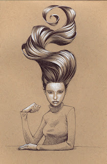
Around Halloween I got a new sketchbook. I was desperately needing something different after using essentially the same size and kind of sketchbook for years. I wanted something wirebound with non-white paper so I could work in both the darker and lighter values. They didn't seem like unreasonable or obscure expectations for a sketchbook but it took a surprising amount of time and research to find what I was looking for. I eventually found this book which I've been loving (it's even eco-friendly for all you hippies out there). The white highlights are done with one of those gel pens and the rest of the sketch is my stalwart Zebra ball point pen. It feels so good to be sketching again on a regular basis.
Subscribe to:
Posts (Atom)


