
Friday, December 28, 2007
Thursday, December 13, 2007
Christmas Card

This is a card I did last year for DWHP. They requested I not go too crazy with the charicatures, but it was a pretty fun project. Some turned out better than others.
Thursday, December 06, 2007
Woodsy Elf, the Making of...

For those that may be interested, I know there's at least one out there, I've provided an insight into how I work to create the images I do, using my recent Elf picture as an example:
1. I start in Photoshop, the background is generally a flat, neutral color. The sketch is on a multiply layer on top of that.
2. I then take the .psd to Painter and do a quick, dirty color/rendering pass with the Digital Airbrush tool on a layer between the background and the drawing. I was at first going for a green/purple color palette though it always changes as I go along.
3. Then, in a new layer on top of the others I do the actual painting usually with the Cover Pencil brush. Here, in addition to rendering the character, I refine the colors and shape.
4. Back in Photoshop I hide the original drawing and, in a new top layer, block out the shape of the character in flat color. I then modify a copy of that shape to display these color gradients.
5. Next, I make the layer I created in step 4 a color layer at about 50% opacity. This gives the colors more depth and variety. I like the effect of one color fading into another that this provides as well.
6. I like wallpaper designs for backgrounds because...well, because. I just make these in Photoshop using the selection tools, Fill command, and Rotate/Translate commands.
7. I pull the opacity of the wallpaper design way down and add gradients and new colors to the background. I then use the Magic Wand tool to select the edges of the character by using the flat color shape I created in part 4. Then using the Edit/Stroke tool I get an outline around the subject.
8. Bringing back the character and adding a little texture to the background gives me the final image.
Wednesday, December 05, 2007

Monday, November 26, 2007

Wednesday, November 14, 2007
Sam the Squirrel - Part 2


Here's the second batch of drawings from the character design workshop here at Avalanche. The last filter we put our characters through was style.The lower image is just a couple of the style explorations I tried, the one on the left is inspired by, but not an exact copy of Miah Alcorn's art. The one on the right is inspired by Stephen Silver. For the final I took the elements I liked from the style exercise (mostly from Stephen Silver) and worked my own style back into the character to hopefully end up with a design that is consistent and appealing. We were asked to render the final image in a way that provided enough information for a modeler to build it in 3D. I'm considering building a model of him myself, we'll see if I end up having the time or not.
Tuesday, November 06, 2007
Sam the Squirrel - Part 1

My fellow artists and I at Avalanche have been putting ourselves through a character design workshop. The character must first be a squirrel, muskrat, or badger and appeal to an audience of boys and girls age 7-11. The character should fill a "helper" role for the player in an action/adventure game. We started the first week with our initial designs and have been critiqueing ourselves and each other on how we can make him/her/it better the next week. We've also been putting our designs through four filters, one each week: Contrast, Novelty, Story, and Style. Week 1 was my initial design, inspired in equal parts by Phoenix Wright, and Sly Cooper, and named after the greatest private detective of them all. He mainly helps the player by analyzing whatever evidence the player finds in their quest. Week 2 I added more contrast to the design by (among other things) thinning the body, enlarging the head, moving the facial features from the center of the face and intensifying the eyes. Week 3 I combined the next 2 filters (since I actually missed a week), for Novelty/Familiarity I made the shapes more unique and tried to unify the squirrel elements. For Story I removed the coat and added a hat which I feel better communicates the background and personality of my squirrel detective. I've so far found the workshop to be extremely helpful and I feel like my design has improved. The final design should be done in the next few weeks. Head over the the Avalanche Blog to see everyone else's.
Wednesday, October 31, 2007
Halloween '07


I didn't get a chance to decorate the house last Halloween since my son was born a fortnight prior to the holiday. This year, however, I found the time and I'm generally happy with the results. I'm even more excited about is this picture I took of them for the following reason: If you look in the lower left corner of the window you'll see my cat sitting, as he often does, on the window sill, the light has caught his eyes in such a way that they appear to be glowing in classic Halloween cat fashion. I included a close up, because I think it's pretty cool. Also on display here is my costume - Mario (Heather was Princess Peach and Max, Baby Yoshi), and my pumpkin which won first place in the pumpkin carving contest at Avalanche.

Thursday, October 25, 2007
The Headless Horseman of Sleepy Hollow

"What was to be done? To turn and fly was now too late; and besides, what chance was there of escaping Ghost or Goblin, if such it was, which could ride upon the wings of the wind?"
-Washington Irving
Tuesday, October 16, 2007

Friday, October 12, 2007
A Woggle of Witches

To be honest, I'm not entirely happy with this. However, sometimes I just want to move on to something else, so here you go.
Thursday, October 04, 2007
This is Halloween

Welcome foolish mortals to Halloween season. I love Halloween. From now until Oct. 31 I'll be watching horror movies, reading scary stories, listening to suspenseful old radio shows, and drawing more Halloween themed stuff. This piece was fun because I included three seasonal stereotypes: the sexy (but dangerous) witch, the Boris Karloff-like undertaker guy, and the mutated, possibly undead-certainly inbred- hilbilly maniac. I'd like to thank the Haunted Mansion in Disneyland from which I stole the background wallpaper design, and my dad who was nice enough to help me with the "Happy Halloween" part of the image.
Friday, September 21, 2007
Pyramid Head

The greatest video game villain of all time! He never says a word, he wears an apron, and his sword is big enough to make Cloud jealous. Oh, and he wears a metal pyramid on his head. However, if you've played Silent Hill 2 you also know he's scary...really scary.
Friday, August 31, 2007
WANTED:

I have been crazy busy, and my blog has, as a result, been crazy neglected. Still, I was able to squeeze some drawing time in here and there to create this image for the Avalanche blog.
Tuesday, August 07, 2007

Thursday, July 26, 2007

Tuesday, July 17, 2007

Tuesday, July 10, 2007

Wednesday, June 27, 2007

Friday, June 15, 2007

Tuesday, June 12, 2007

Thursday, May 31, 2007

Friday, May 25, 2007
Yo Ho Ho and a Bottle o' RUM!

There are two types of people in this world, those who like the Pirates of the Caribbean movies and crazy people. The third film is awesome. Go see it.
Monday, May 21, 2007

Wednesday, May 16, 2007


Wednesday, May 02, 2007
Axe Angel

I've been working on this one for a while and I'm still not really happy with it, but I'm also tired of it, so here you go.
Wednesday, April 25, 2007

Monday, April 09, 2007

Thursday, April 05, 2007


Friday, March 30, 2007

Tuesday, March 27, 2007
Meet the Concept Art


 The Meet the Robinsons video game hits retailers today so I thought it an appropriate time to post some concept art I did for the game. None of these designs made it in the game, but I like to think they had a little influence on the end product. My position here at Avalanche is in production and I think it's ultimately the right place for me, but I'm glad that I can occasionally do a little visual development because I really enjoy it.
Wednesday, March 21, 2007
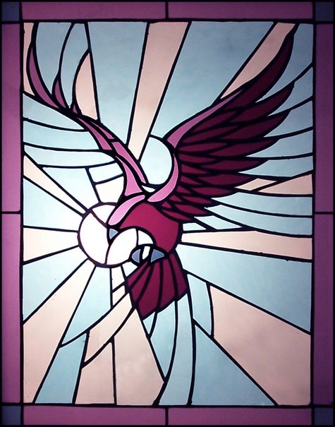
Glass Tree

My parents recently built an addition onto their house which includes a new bathroom with a cool octagonal window. I like doing the occasional stained glass project and my mother thought the previously mentioned window would be good space to include one. It's not perfect, but I think it turned out better than my last stained glass piece, and it looks really nice in my parents bathroom (this photo was taken at my house before it was installed, in case there was any confusion). I can't take all the credit since my mom picked out all the glass and I think she chose some really nice colors and textures.
Monday, March 19, 2007
Trailer Ho!

Today, like every other day, is a good day to love pirates. Not just for all the regular awesome reasons, but because tonight is the world premiere of the Pirates of the Caribbean: At World's End movie trailer on ABC! The only potential problem is that it's debuting sometime during the 2 hour Dancing with the Stars season premiere (at 8/7c). Of course the internet will have it everywhere the day after, if you can wait. Me, I'm watching Dancing with the Stars tonight.
Tuesday, March 13, 2007
Rock Tree

 I like the way this tree turned out because it kind of reminds me of an album cover by Roger Dean or Rodney Matthews for some progressive rock band in the 70's.
Friday, March 09, 2007
Movie Posters Rant
 The Maltese Falcon is a great film. Sharp dialogue, incredible characters, great performances, thick atmosphere, and a fantastic story all work together to create a spectacular film that is cooler than ten Tarantino movies. Great movies don't always have great posters and the Maltese Falcon is a good example of that. While none of the images created for the film have been particularly bad, I feel it's always lacked a definitive poster that adequately captures the spirit of the film. Hopefully mine does to some extent.
I'm always irritated by bad posters or DVD covers for good movies. The original poster for Mulan is a favorite of mine. It's a very cool image that captures the spirit of what the film is truly about. Yet when it came time to release the film on DVD the marketing guys thought process must have went something like this: "We need more characters on the cover, and what about Mushu, everyone loves him. The oriental color scheme might alienate western consumers," and so on. Thus, the DVD was released with this cover.
Return of the Jedi has made $309 million in domestic box office earnings alone, but apparently that was not enough to give it a decent DVD cover (all the Star Wars DVD covers are bad, but this one really bugs me in particular for the following reasons):

 My favorite part is the position and size of Luke's hands. In my modified version to the right I roughly painted in what his arms would have to look like based on the positions of his wrists and shoulders to actually attach his body to those hands. I also like the stars shooting out of the lens flare of his light sabre and the various characters and objects that all look like they came from different sources with no effort put into unifying the values, colors, saturation, etc. But the thing that really irritates me about this cover is that a lot of artists, Drew Struzan in particular, have created excellent pieces of promotional art for all the Star Wars films. There's no excuse for this poorly photoshopped junk.
Anyway, you're probably asking why I care so much, I'm not really sure actually. The poster or cover doesn't affect the content on the film or the disc. I just hate having some of these hideous things on my shelf.
Monday, March 05, 2007

Monday, February 26, 2007

Subscribe to:
Posts (Atom)